Checkbox
Design annotations are needed for specific instances shown below, but for the standard checkbox component, Carbon already incorporates accessibility.
What Carbon provides
Carbon bakes keyboard operation into its components, improving the experience of blind users and others who operate via the keyboard. Carbon incorporates many other accessibility considerations, some of which are described below.
Keyboard interactions
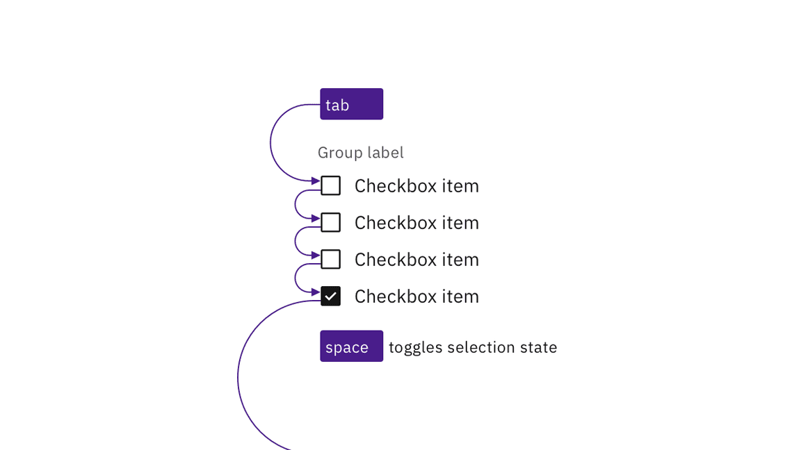
Each checkbox can be reached by Tab and selected with Space independently.
This matches the established HTML interaction pattern.

Carbon checkboxes retain expected interactions.
Grouping
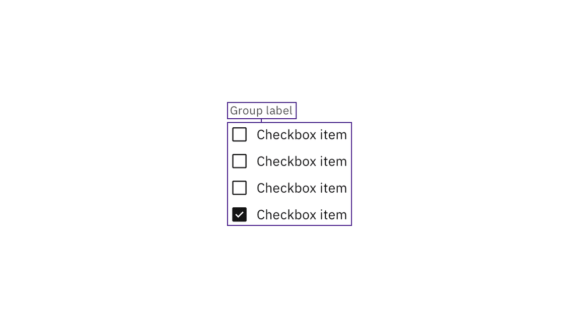
For groups of checkboxes, Carbon already provides the code for screen readers to properly detect the set of checkboxes and announce the group label.

Carbon handles the accessibility of grouped checkboxes.
Design recommendations
Design annotations are needed for the following instances.
Meaningful order
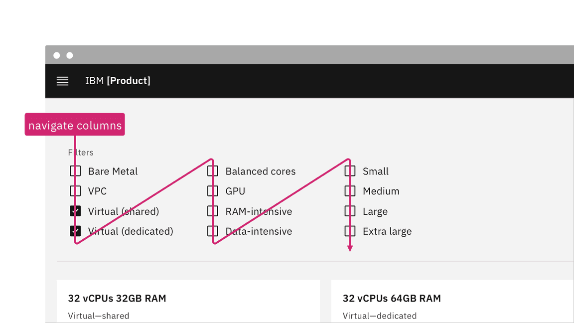
Checkboxes can appear in multiple columns. If there is a meaningful order to the items (such as days of the week), annotate whether the tab order is by row or by column. See Specify the tab order.

Annotate if there is meaningful navigation order in rows of checkboxes.
Development considerations
Keep these considerations in mind if you are modifying Carbon or creating a custom component:
- Checkboxes are grouped using
<fieldset>and<legend>. - A tri-state checkbox that is partially checked (indeterminate) has
aria-checkedset to"mixed". See Behaviors on the Usage tab for details. - See the ARIA authoring practices for more considerations.